
Dark, violet brand look
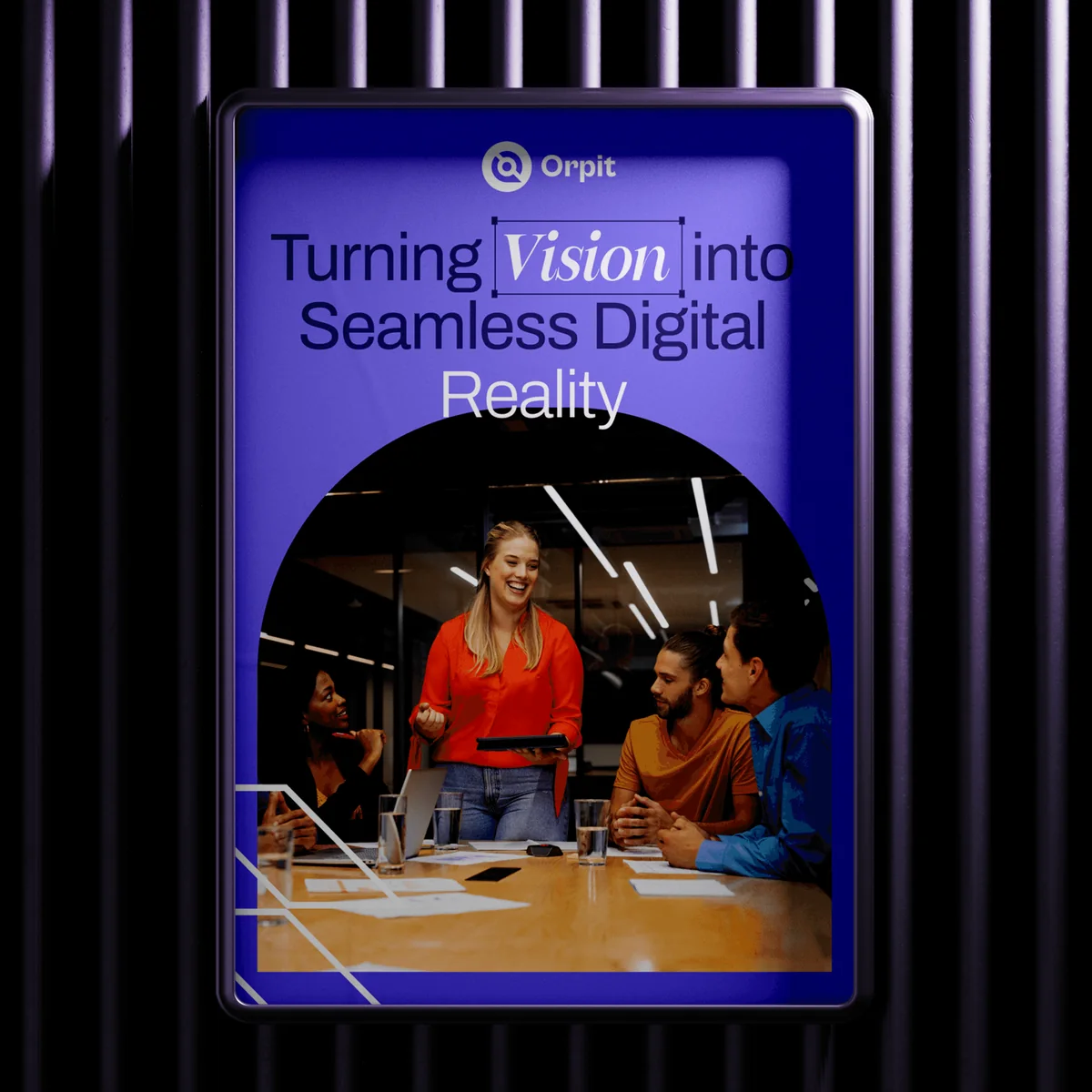
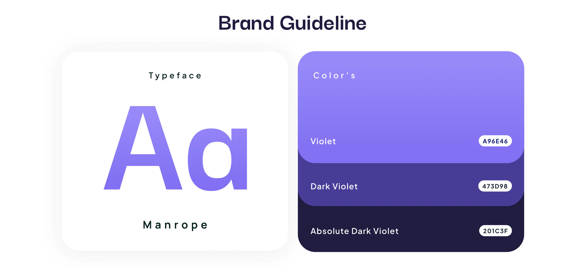
A dark background with violet accents, bold Manrope type, and soft glow effects gives Orpit a distinct look, carried through the logo, icons, business cards, signage, and posters.

Websitefor Orpit
A website project in agency, delivered by DeveloperLook.
About the project
DeveloperLook designed and built the Orpit website, a dark, violet-accented site for a creative design and development agency that walks visitors from its process and portfolio to a booked call.
Orpit is a creative design and development agency that helps businesses build digital experiences through modern websites, branding, and custom software. The goal of this project was a sleek, professional, conversion-focused website that reflects Orpit's creative and technical skill, builds trust, and attracts new clients.
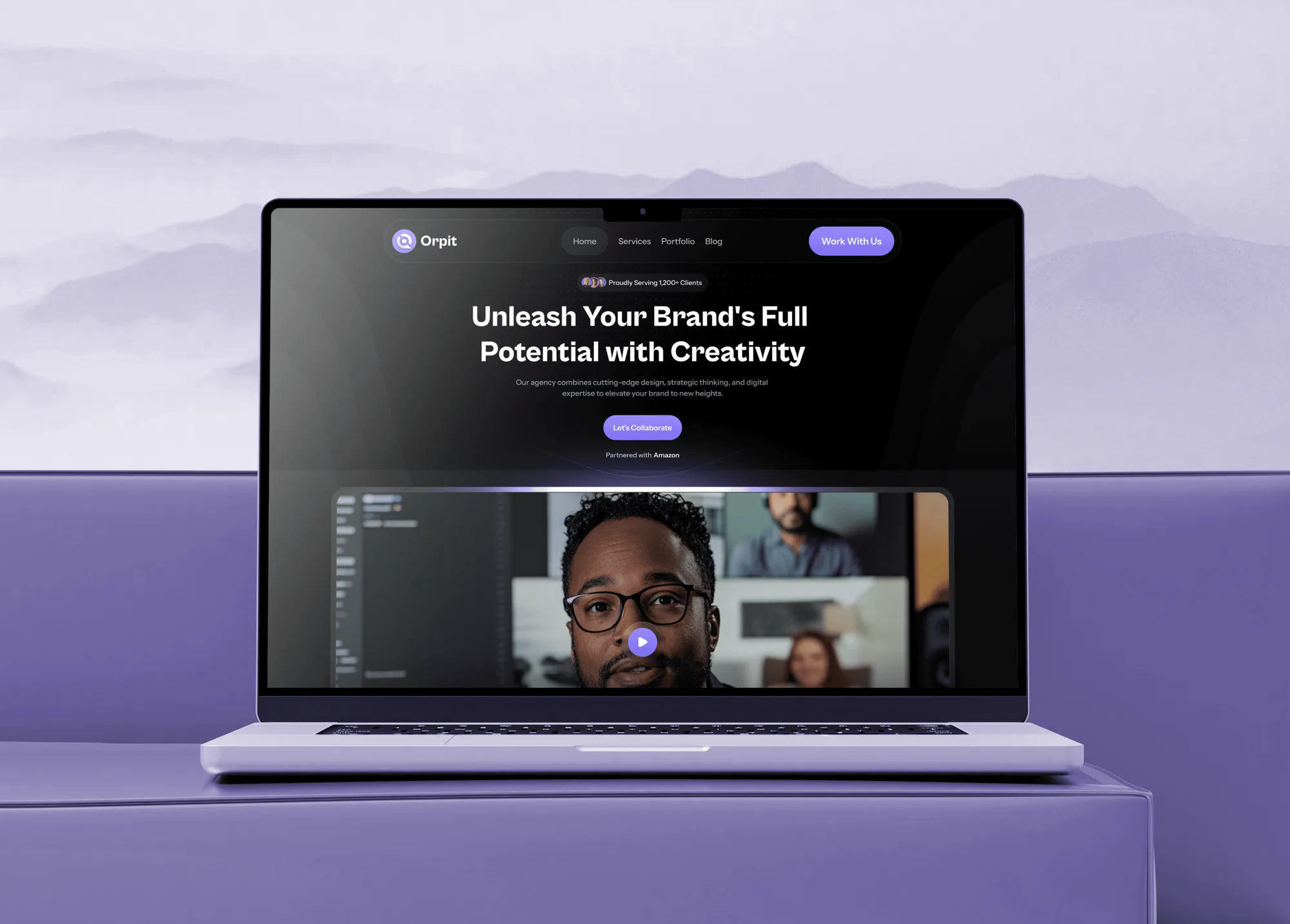
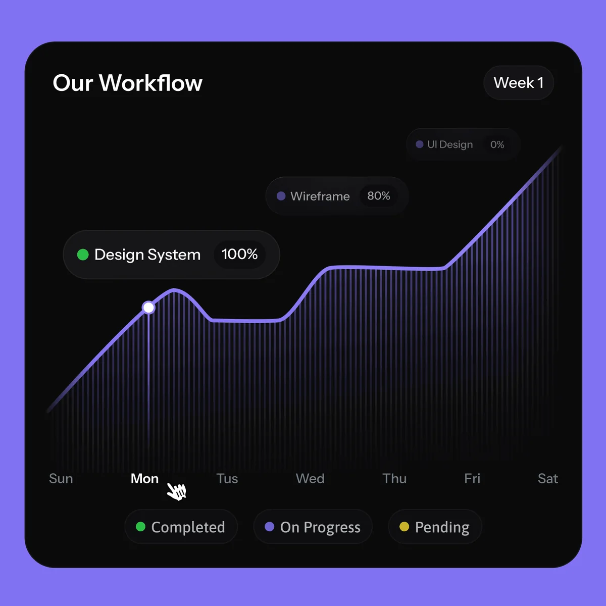
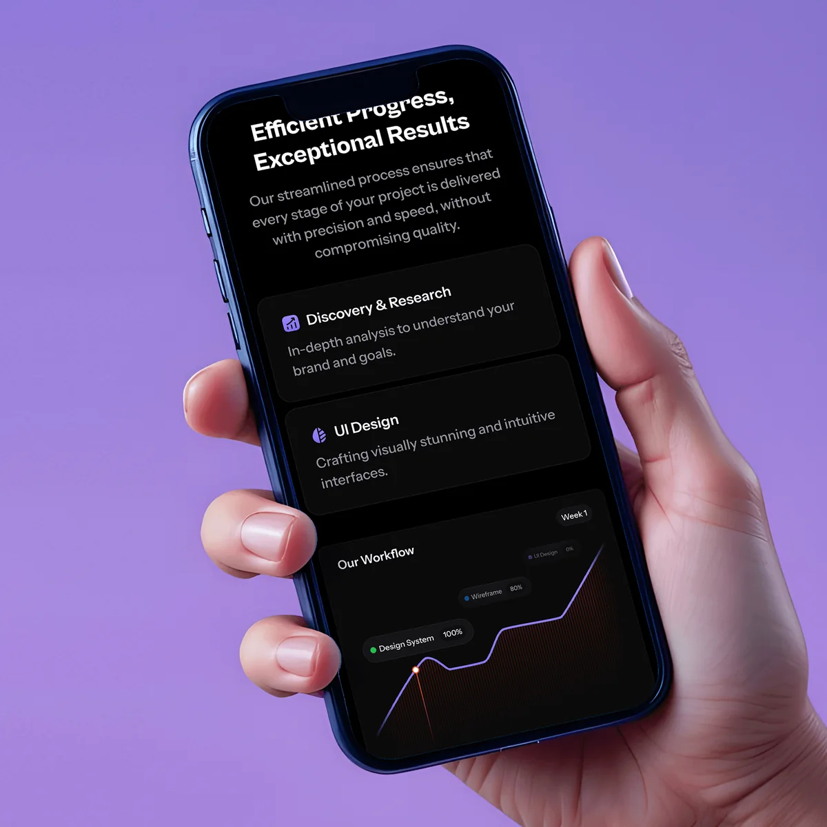
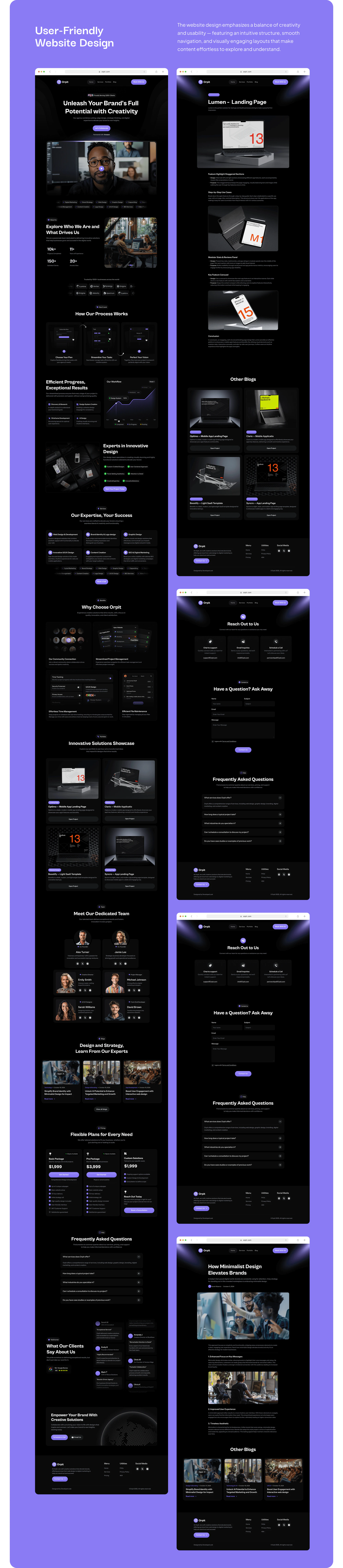
The home page opens with a bold headline, a Let's Collaborate button, and a team video. It then explains how Orpit's process works (discovery and research, design system creation, wireframes, and UI design) beside a weekly workflow chart, followed by the agency's areas of expertise, reasons to choose Orpit, a portfolio showcase of landing pages and app designs, the team, articles, pricing plans, FAQs, and client reviews. Each portfolio item opens a project page with images and related work.
A contact page offers three routes (chat with support, email, or a scheduled call) and a short question form, and a blog page lists trending topics and expert tips with search. The design runs on a dark background with violet accents and the Manrope typeface, and the brand system extends to the logo, icons, business cards, office signage, posters, and social posts. Every page has a mobile layout.
Tell us what you are building. We reply within 24 hours with questions or a call time.
What do you need?
Challenge and solution
The challenge
It had to look striking, load fast, perform smoothly, and match the brand's personality.
The content also had to balance creativity with technical credibility while staying responsive and ready for search engines.
Our solution
Clean layouts, subtle animations, and bold typography communicate innovation and confidence, and the site architecture guides visitors through services, case studies, and contact points.
On the backend, we tuned performance and planned for long-term growth.
What we built
Eight features, shown next to the screens they live on.
A dark background with violet accents, bold Manrope type, and soft glow effects gives Orpit a distinct look, carried through the logo, icons, business cards, signage, and posters.
A How Our Process Works section and a workflow chart show each step (discovery and research, design system creation, wireframes, and UI design), so prospects see how a project moves week by week.
An Innovative Solutions Showcase presents landing pages and app designs as cards with an Open Project button, and each project page adds large visuals and links to related work.
A Meet Our Dedicated Team section introduces each person with a photo, role, and social links, so potential clients see the people behind the work before they reach out.
A Flexible Plans for Every Need section lays out packages side by side with what each includes and a button to start, so buyers can compare before they talk to the team.
The contact page offers chat with support, email inquiries, or a scheduled call, plus a Have a Question? Ask Away form with name, subject, email, and message fields.
A blog page lists trending topics and expert tips with search, and each article page shows the author, date, and related posts, which keeps the agency's expertise visible.
Client reviews with a Google rating badge and an FAQ section answer common questions and add proof just before the final Schedule a Call and Email Us buttons.
FAQ
 Saimul IslamFounder & CEO, DeveloperLook
Still have questions?
Send a message or book a call with the team.
A conversion-focused website and brand system for Orpit, a creative design and development agency. The site covers the home page, process, expertise, portfolio and project pages, team, pricing, FAQs, client reviews, a blog, and a contact page. The brand work includes the logo, violet palette, Manrope typeface, icons, business cards, signage, and social posts.
Step by step. The hero opens with a Let's Collaborate button, the process and portfolio sections build confidence, and pricing, reviews, and FAQs answer common doubts. The page closes with Schedule a Call and Email Us buttons, and the contact page adds chat and a question form.
The dark background with violet accents matches Orpit's brand personality and makes portfolio visuals and calls to action stand out. Bold Manrope headings and subtle animations add energy, while clean layouts keep each section easy to read on desktop and on mobile.
Through a portfolio showcase of landing pages and app designs, each with an Open Project button. Project pages present large visuals and link to related work, and a process section explains how Orpit runs a project from discovery to UI design.
Yes. Every page has a mobile layout: the hero, process, workflow chart, portfolio, team, reviews, blog, and contact form all adapt to phones and tablets. Buttons such as Let's Collaborate and Schedule a Call stay large and easy to tap on a small screen.
Yes. DeveloperLook designs and builds agency websites with a clear process section, portfolio and project pages, pricing, a blog, and contact options, plus the brand system around them. We start with how your clients choose a design partner, then build each page to answer their questions in order.
Saimul IslamFounder & CEO, DeveloperLookStill have questions?
Send a message or book a call with the team.
Free 30-min callGoogle Meet
Book a call
In 30 minutes on Google Meet we walk you through how we would build it, how long it takes and what it costs. Then you get a written estimate.
Calendar not showing? Book on cal.com or send a brief.