Trip posters with prices
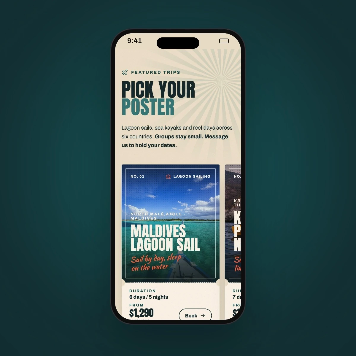
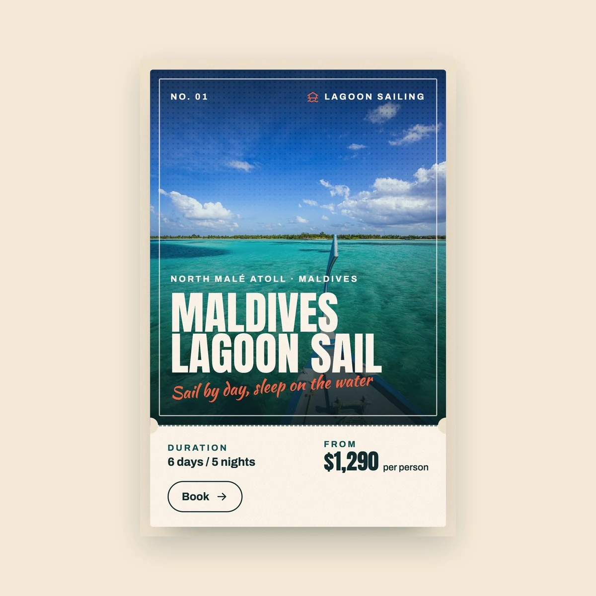
Featured trips appear as numbered travel posters with the route, trip length and starting price, each with its own Book button. A weekender is styled as an admission ticket.

Website
A website project in travel, delivered by DeveloperLook.
About the project
DeveloperLook designed and built a poster-style landing page for a small-group sea and island trip company: trip posters with prices, an illustrated route map, a trip film and a crew newspaper. It is shown under a sample brand, Tidewild Adventures, so the client stays private.
Tidewild is a one-page website for a company running small-group sea and island trips around the Indian Ocean, designed and built by DeveloperLook. We show it under a sample brand, Tidewild Adventures, so the client behind the original project stays private: the names, prices, reviews and stats are sample content, while the design and build are our work.
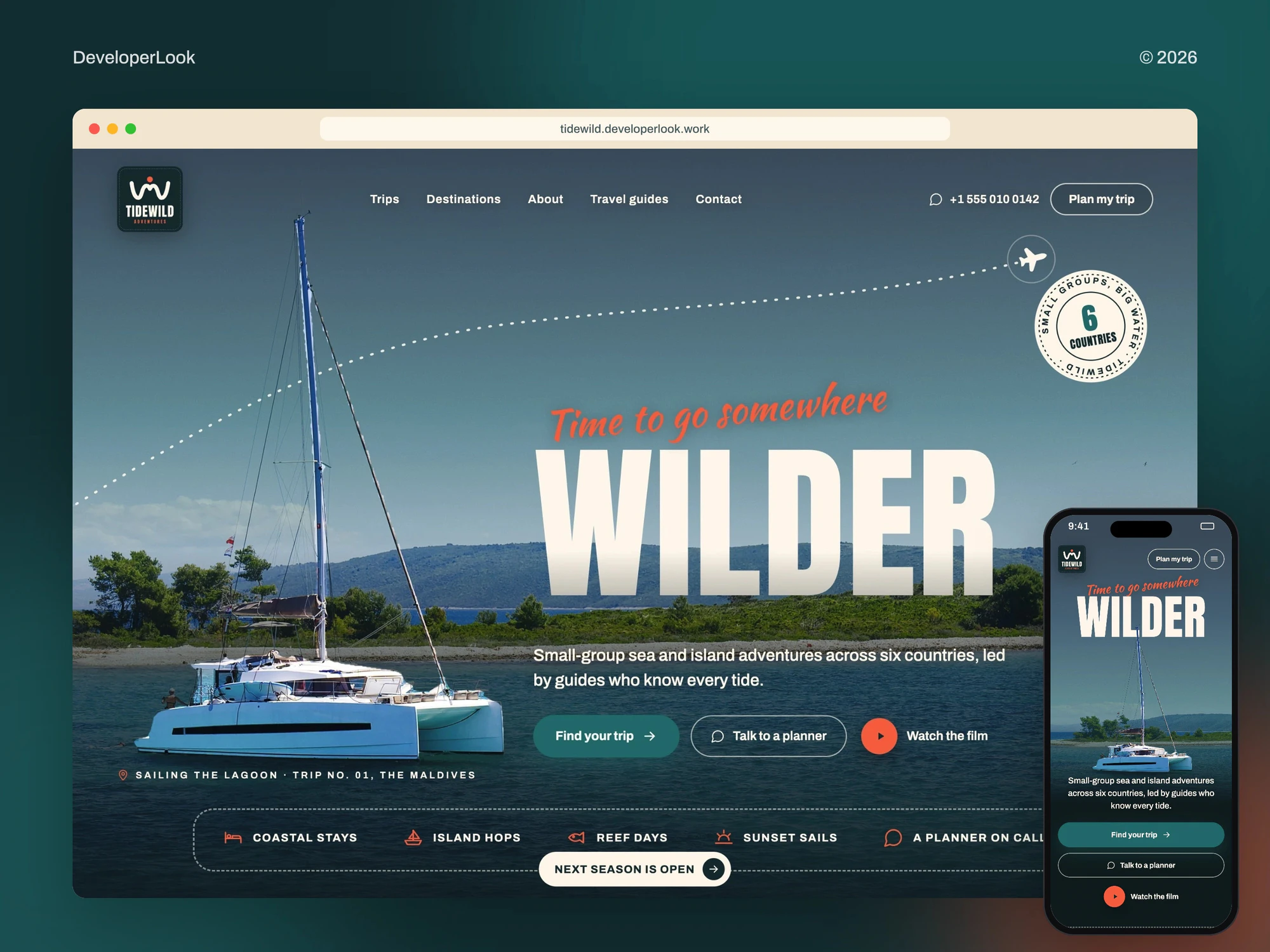
The page reads like a stack of travel posters. The hero places a catamaran above the shade so it stays bright while the sea behind the headline darkens, and a ticker runs through the six countries. Featured trips appear as numbered posters with the route, trip length and starting price, and a Sri Lanka weekender is styled as an admission ticket. In You don't need a map, the headline slips between the photo and a cut-out of the island.
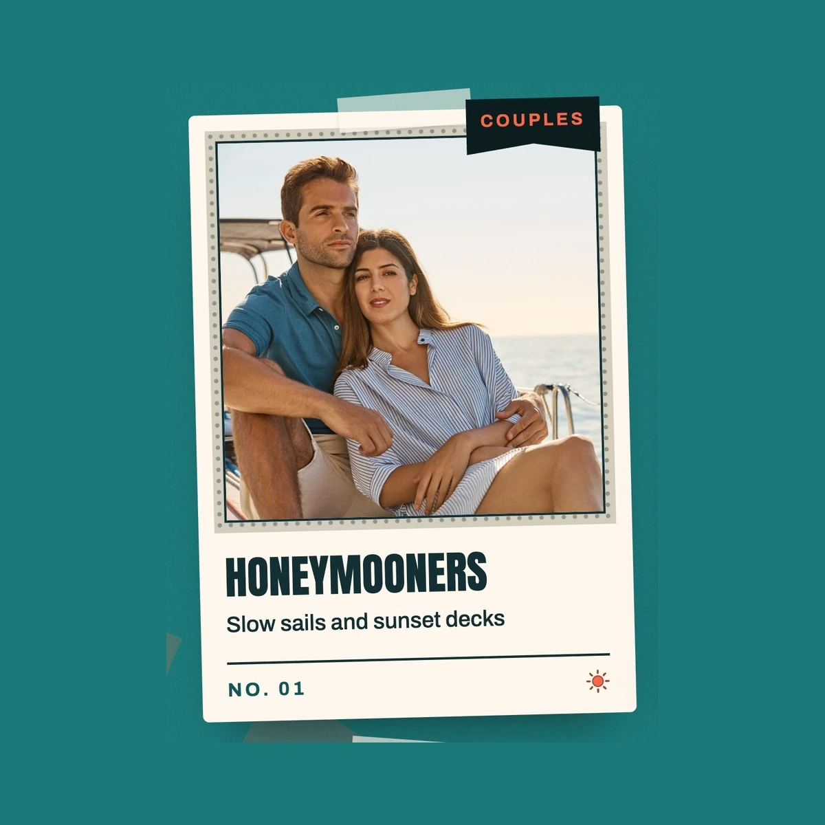
Further down, a 30 second film plays from a ticket-style card, an illustrated map traces the blue routes from the Gulf of Oman to the Flores Sea, and polaroid cards match trips to honeymooners, families, friends, divers, solo travellers and adventure seekers. Guest postcards carry the reviews, a newspaper called The Tidewild Times holds the travel guides, and an FAQ and a closing call to plan the trip end the page.
The site is built with Next.js and TypeScript and exported as static HTML, with its own layouts for desktop and phone.
Tell us what you are building. We reply within 24 hours with questions or a call time.
What do you need?
Challenge and solution
The challenge
A traveller needed to see the route, trip length, starting price and who each trip suits at a glance, then reach a planner in one tap.
Our solution
What we built
Eight features, shown next to the screens they live on.
Featured trips appear as numbered travel posters with the route, trip length and starting price, each with its own Book button. A weekender is styled as an admission ticket.
In the hero the catamaran sits above the shade so it stays bright, and in You don't need a map the headline slips between the sea and a cut-out of the island.
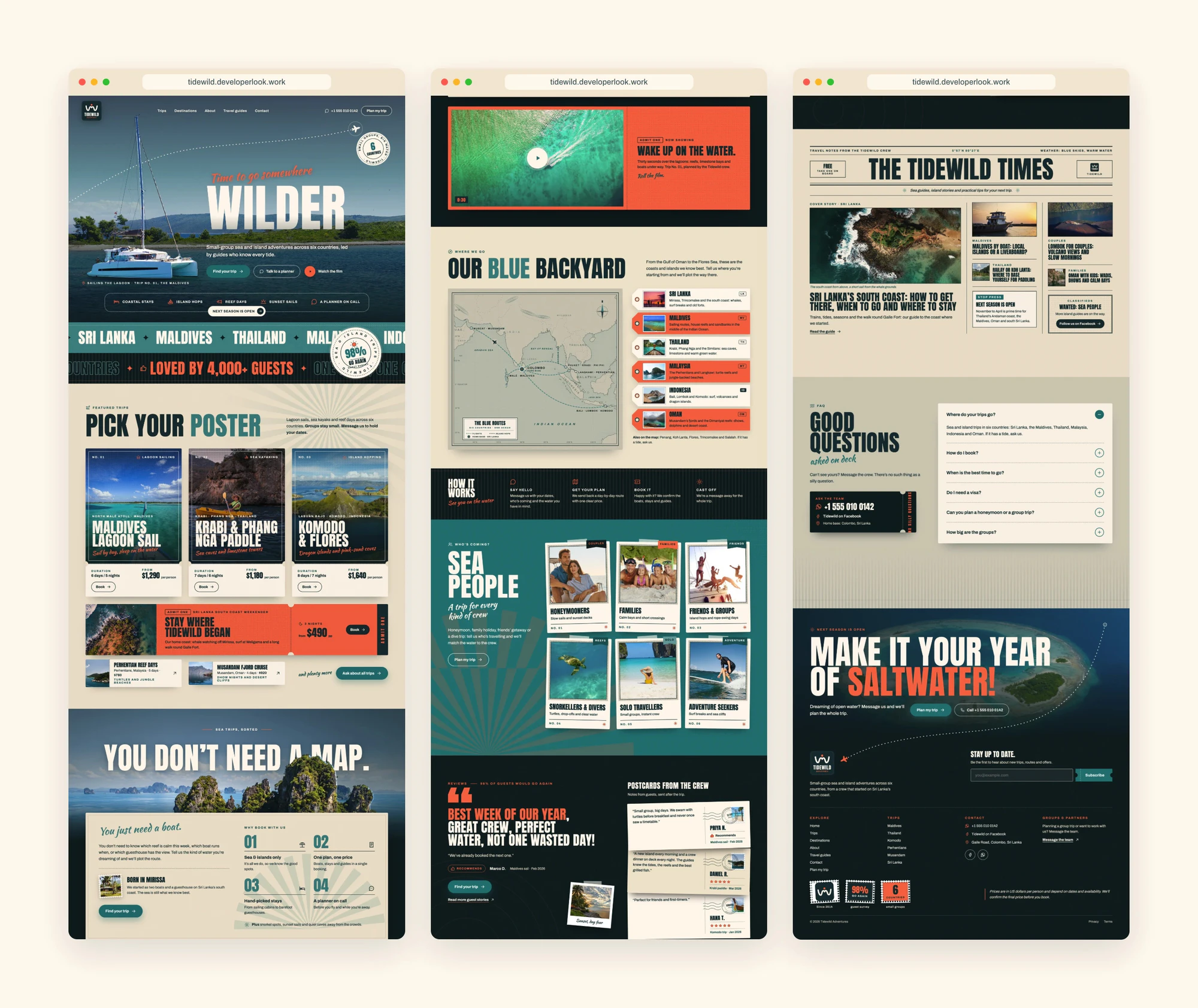
A vintage-style map traces the blue routes from the Gulf of Oman to the Flores Sea, beside a tag for each of the six countries.
A 30 second film of lagoons, reefs and limestone bays plays from a ticket-style Now showing card.
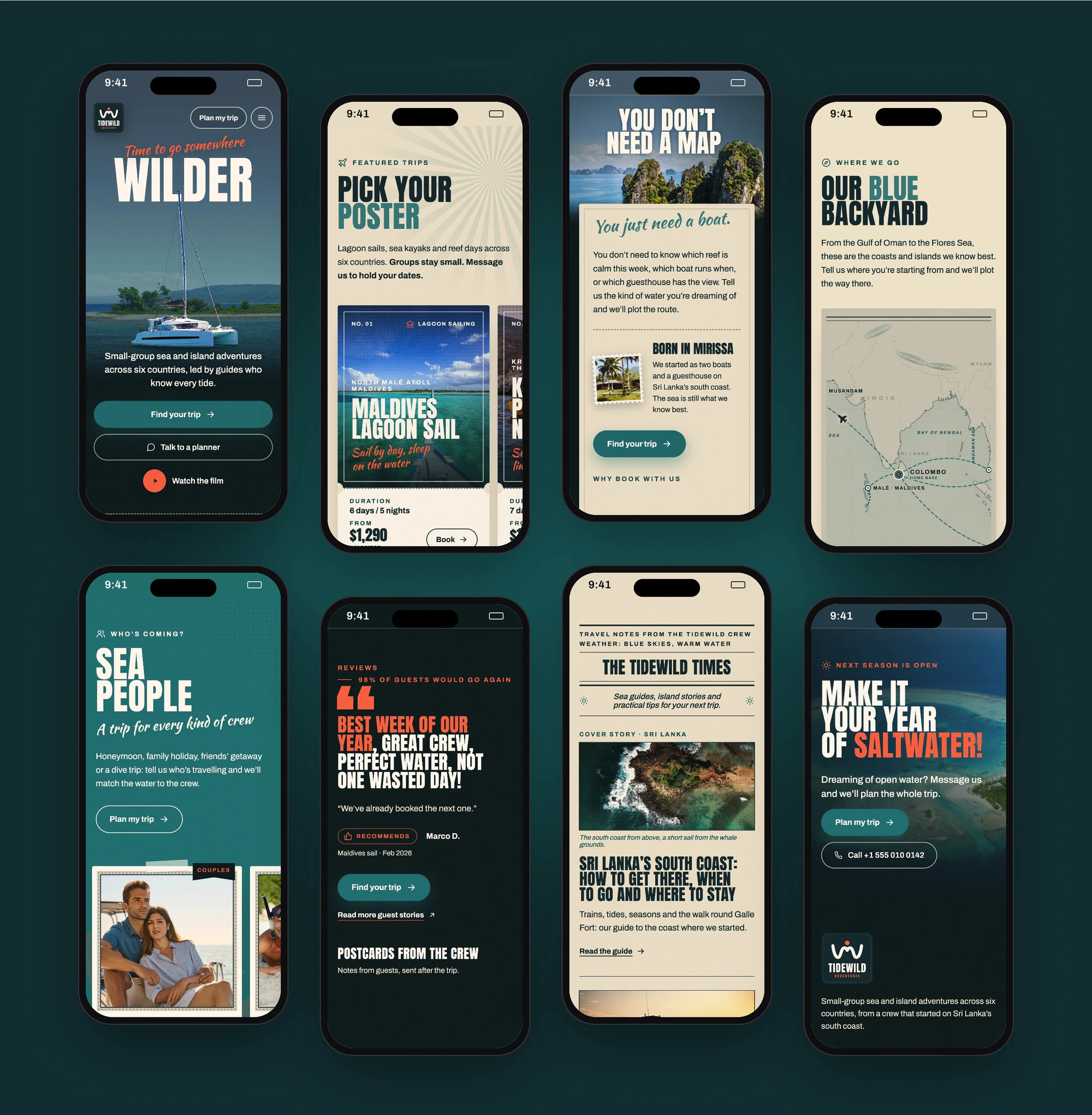
Polaroid cards match trips to honeymooners, families, friends, snorkellers and divers, solo travellers and adventure seekers.
Reviews appear as postcards from the crew beside a large pull quote with the guest's name and trip.
Travel guides sit in a newspaper layout with a cover story, side columns and practical tips for the next trip.
Every section has its own phone layout: trip posters become a swipe row, the menu folds behind one button and the call buttons span the full width.
FAQ
 Saimul IslamFounder & CEO, DeveloperLook
Still have questions?
Send a message or book a call with the team.
DeveloperLook designed and built a one-page website for a small-group sea and island trip company: a poster-style hero, trip posters with prices, a why book section, a trip film, an illustrated route map, trips for each kind of traveller, guest reviews, a travel guide newspaper, an FAQ and a closing call to plan a trip.
No. Tidewild Adventures is a sample brand. We rebuilt a landing page we delivered with new names, photos, prices and reviews so the client stays private. The design and the build are the work we did, and the demo at tidewild.developerlook.work can be clicked through on desktop and phone.
Each trip poster shows the route, trip length and starting price with its own Book button, and polaroid cards point couples, families, friends, divers and solo travellers to the trips that suit them. Plan my trip and Talk to a planner buttons run from the hero to the closing band, so a traveller can reach a planner from any section.
Yes. Every section has its own phone layout, not a shrunken desktop page. Trip posters sit in a swipe row, the cut-out headlines resize with the screen, the menu folds behind one button and the call buttons span the full width. The gallery shows eight of these phone screens.
The page is built with Next.js, React and TypeScript and exported as static HTML, so it can run on Cloudflare Pages without a server. Photos are pre-sized for each slot, the brand colours live in one file, and the 30 second film stays under Cloudflare's file size limit.
Yes. We would start from your trips, destinations and how you take enquiries, then design trip cards, destination and trust sections around them and build the page on a fast, modern stack. Contact us with your current setup and we will suggest where to begin.
Saimul IslamFounder & CEO, DeveloperLookStill have questions?
Send a message or book a call with the team.
Free 30-min callGoogle Meet
Book a call
In 30 minutes on Google Meet we walk you through how we would build it, how long it takes and what it costs. Then you get a written estimate.
Calendar not showing? Book on cal.com or send a brief.