
Breakpoint layout plan
A map of every template with phone, tablet, and desktop layouts you approve before the build starts.

For businesses whose site looks right on a laptop but cramped on a phone: layouts rebuilt to fit every screen and tested on real devices, from $850.
100%
Key pages fit every screen
320px
Narrowest screen we test
Teams we have built for:














The Problem
The problem shows up when most of your visitors arrive on phones, but the site was designed on a desktop screen and squeezed down later.
01 · Zoom
Visitors pinch and scroll sideways to read a single paragraph.
Layouts reflow to one column at 320px, so text reads without zooming.
02 · Menus
The mobile menu hides links or won't open on touch.
We rebuild navigation for thumbs, with tap targets that meet WCAG 2.2 size rules.
03 · Forms
Quote forms run off the screen and open the wrong keyboard.
Fields stack, and email and phone inputs open the matching mobile keyboard.
04 · Images
Phones download full desktop photos, so pages load slowly.
Responsive images serve smaller files to smaller screens.
A customer taps your ad on the train, and your homepage loads as a tiny desktop page. They pinch to zoom, the menu hides behind an icon that won't open, and the quote form's submit button sits off the edge of the screen. Your 3-column service grid shrinks to text the size of a footnote. They close the tab and call the next business in the results. You don't see it happen, because on your laptop everything looks fine.
We start with your analytics: which devices and screen widths your visitors use, and which pages they land on. Then we set breakpoints where your content breaks, not at generic device sizes, and rebuild layouts mobile-first with fluid grids, flexible type, and images sized for each screen. Every template gets tested on real phones and tablets before launch. You fix the design once, instead of patching it device by device.
Breakpoints set by content
Layouts change where your content needs them to, not at a list of popular phone widths.
Tested on real devices
iPhones, Android phones, and tablets, plus BrowserStack for the models we don't keep in the office.
Images sized per screen
srcset and modern formats, so phones download small files instead of desktop-sized photos.
Our Responsive Web Design Services Process
You see the screen widths your visitors use, approve the layouts for phone and desktop, and test the staging site on your own phone before anything goes live.
We open your key pages at 6 screen widths, check your analytics for real device use, and run Lighthouse on mobile. You get a list of what breaks where, which templates need work, and the plan that fits.
What's Included
A responsive version of your site that keeps your content and URLs. Layouts, navigation, images, and forms get rebuilt for phones, tablets, and desktops, with test results to prove it.
Compare Options
A new responsive template is the cheapest route if you're happy to change your design, and a plugin is quick. Here's how each compares with a responsive web design agency rebuilding your own layouts.
| Feature | DeveloperLookBest fit | Template swap | Mobile plugin |
|---|---|---|---|
| Breakpoint planning | Set by your content | Fixed by the theme author | Auto-generated mobile view |
| Your current design | Kept and adapted | Replaced by the template | Simplified for phones |
| Small phone layouts | Reflows cleanly at 320px | Usually fine on stock pages | Separate stripped-down layout |
| Device testing | Real phones plus BrowserStack | Theme demo only | Rarely tested |
| Mobile speed | Sized images, lean CSS | Depends on theme weight | Extra scripts loaded |
| Upfront cost | From $850 | Cheapest upfront option | Low monthly fee |
| Ongoing edits | One site, one edit | One site, one edit | Two versions to update |
| Ownership | Code and files are yours | License from the theme seller | Tied to the plugin |
Projects We've Built
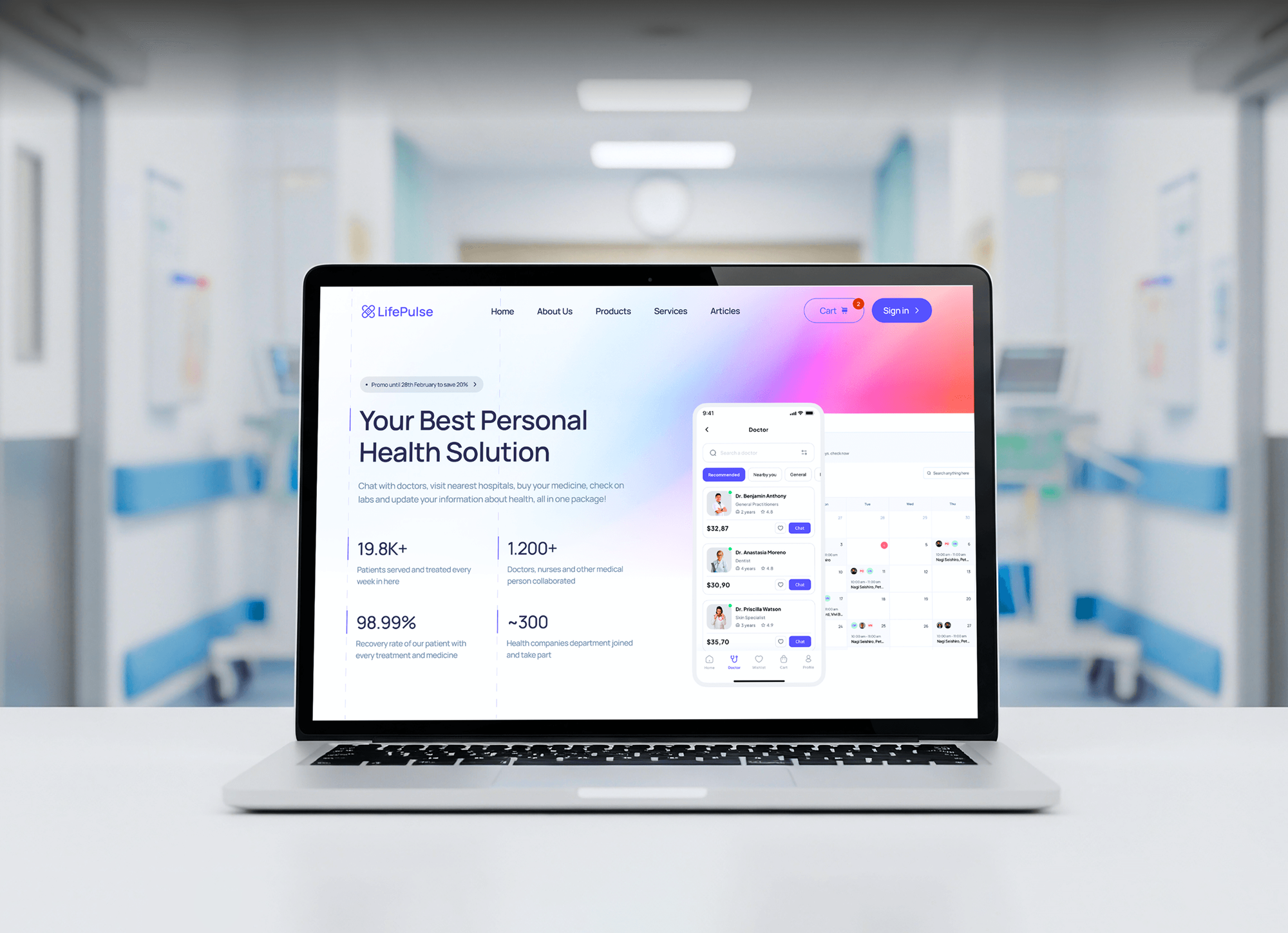
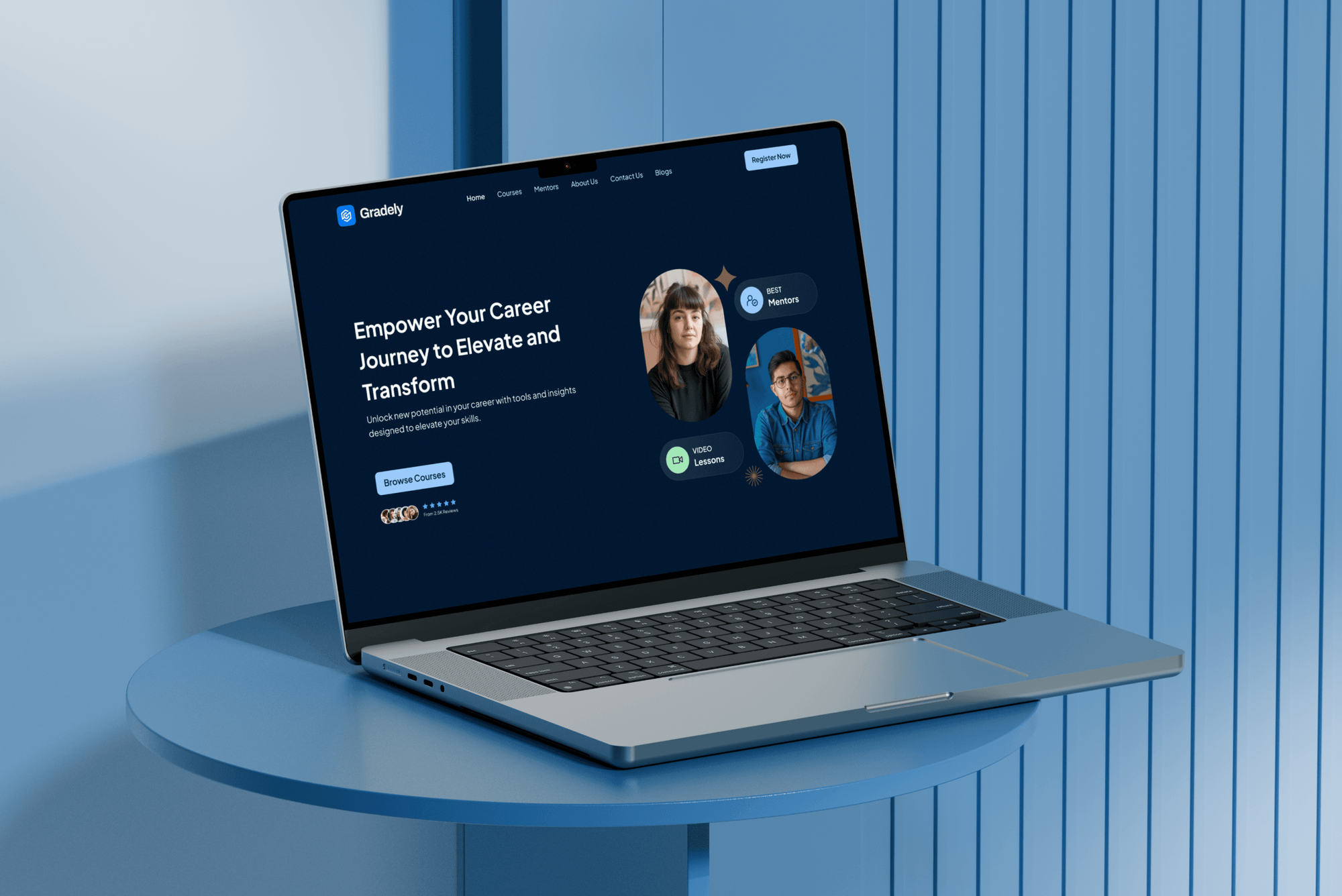
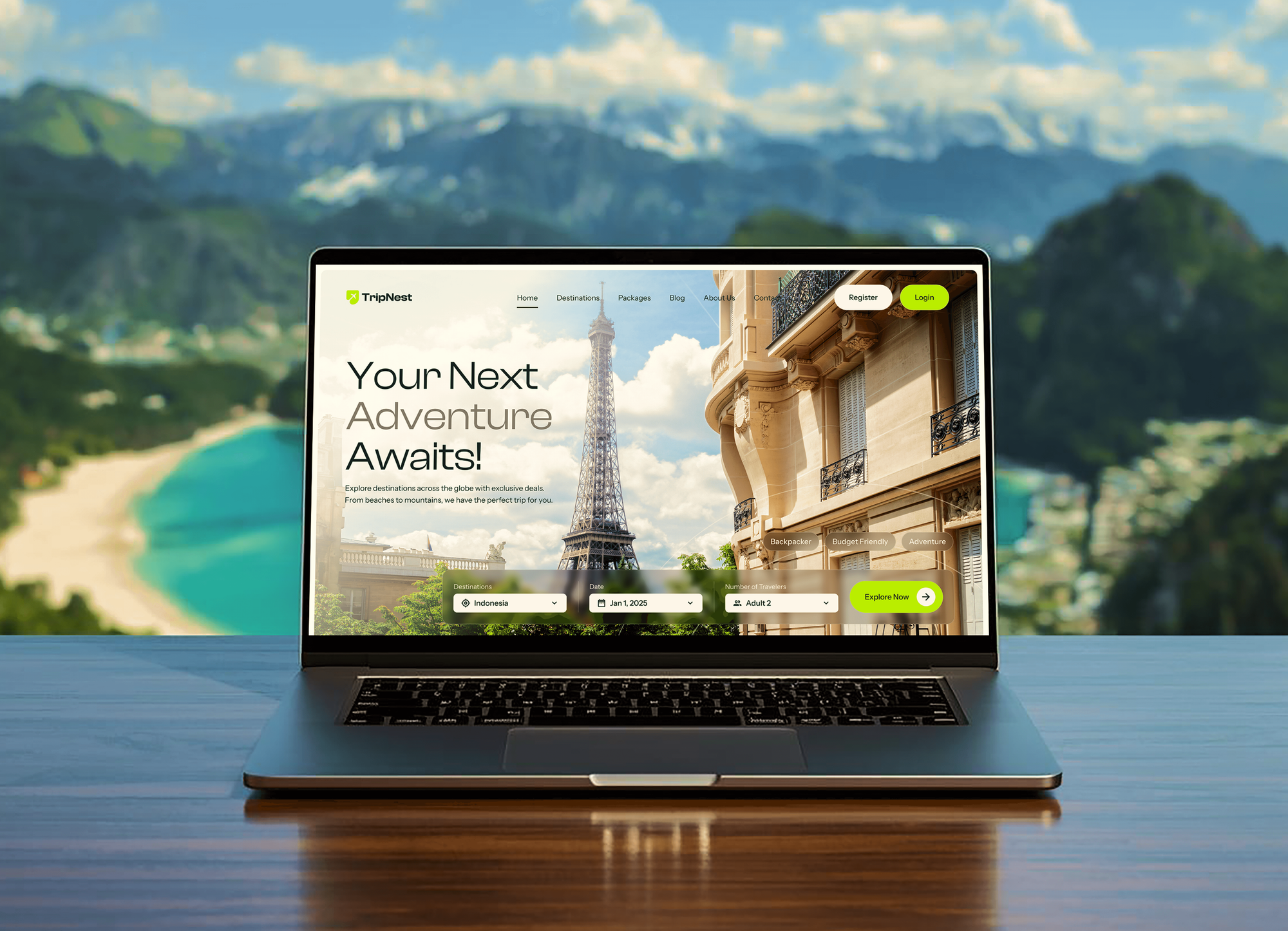
Websites we designed and built to work on phones, tablets, and desktop screens, from a medical practice and a restaurant to course and travel platforms.

What Our Clients Say
Feedback from teams we have designed and built websites for.
We had a pretty specific idea of what we wanted our website to become, but I wasn’t sure how easily we could explain all of it to a development team. There were quite a few moving parts, and we were working toward a deadline, so I expected a few things to get lost along the way. That never really happened. They understood what we were trying to achieve, kept us updated throughout the process, and got everything ready within the agreed timeline. The final site feels much easier to navigate, works beautifully on mobile, and is noticeably smoother for our customers. It was a huge relief seeing the original idea actually turn into the website we had in mind.
The mobile experience is probably my favourite part of the new site. We had spent a lot of time making sure the desktop version looked right, and the team kept pushing us to think about how everything would actually feel on a phone too. They were right. The navigation is clean, the interactions feel natural, and everything we’ve tested so far works exactly as it should. They also went through the links, forms, integrations, and other details more than once before launch, which I really appreciated. And even after going live, we could still reach out when something came up. The whole process felt friendly, organised, and surprisingly straightforward.
What I appreciate most is that the website is actually easy for us to manage now. We can update content ourselves instead of sending a developer a message every time we need to change something small. They also paid attention to the technical SEO side, which mattered to us because we didn’t want a new website to create problems for the traffic we already had. I’ve probably asked more questions than I should have since launch, but every question has been handled patiently and without any fuss. The team is easy to work with, they explain things clearly, and when we need something changed, they focus on getting it done rather than making the process complicated.
1,250+
Projects shipped
10+
Years of experience
Top 3%
Upwork Top Rated Plus
5 stars
Average review score

Want results like these?
Tell us what you are building. You get a reply within 24 hours on business days, then a written estimate.
Work Culture
What we do differently as a responsive design company: we design from the smallest screen up and test on the devices your visitors actually use.
We design the 320px layout before the desktop one. Content that works in a narrow column usually works wider, and the reverse is rarely true.
We check which devices and widths your visitors use before setting breakpoints. A B2B site with desktop buyers and a restaurant full of phone visitors need different priorities.
We test menus and buttons by tapping them on actual phones, not just by shrinking a browser window. Emulators miss tap targets that sit too close together.
If a modern responsive theme already fits your brand, we'll tell you before we quote. Custom responsive work makes sense when your design or features are worth keeping.
Phones on cellular connections feel every extra image and script. We size images per screen and cut unused CSS while we rebuild the templates.
Code, Figma files, and device test results are yours at handover. Any developer can maintain the responsive templates after we finish.
Overview
DeveloperLook provides responsive web design services that make existing and new websites work on every screen, from a 320px phone to a wide monitor. We plan breakpoints, rebuild layouts mobile-first, add responsive images, and test on real devices. Projects start at $850 and take 1 to 6 weeks, and you own the code.
DEVELOPERLOOK
Project facts · Responsive Web Design Services
Reviewed 7 Oct 2026 by Saimul Islam
Good fit
Sites built before mobile mattered
Your site was built before mobile responsive web design was standard, and on phones visitors still see a shrunken desktop page.
WordPress sites with a dated theme
Your WordPress theme is old, but your design and content still work, and you'd rather adapt the layouts than start over.
Businesses losing mobile leads
Your analytics show most visitors arrive on phones, yet almost every quote request comes from desktop, and you suspect the mobile form.
Webflow or Next.js sites with layout bugs
Your Webflow or Next.js site breaks at tablet width, with overlapping text and images pushed off screen at certain sizes.
Agencies short on front-end time
You sold a client a mobile refresh and need a responsive website development company to rebuild the templates under your brand.
Not a fit
Whole site needs rethinking
Your content, structure, and branding all need rethinking, not just the layout. Website Redesign Services plans the new site first, then builds it responsive.
No real website yet
You don't have a website yet, or it's a one-page placeholder. Small Business Website Design Services builds a new responsive site from the start.
Budget under $850
You only need one page fixed, such as a single landing page. A freelancer or your theme's built-in mobile settings will cost less than our smallest plan.
Store pages and cart
Your mobile problem is a Shopify or WooCommerce store's product pages and cart. Ecommerce Website Design Services covers store templates and checkout flows.
Not sure we're the right fit?
Book a free call or message us. We'll tell you honestly whether we're the right team.
Pricing
These are starting points in USD. Your final price depends on your template count and current code, and you get a fixed proposal after a free mobile review.
For sites that look right on desktop but break on phones across a few key templates.
$850one-time, USD
For sites that need every template rebuilt mobile-first on the CMS they already use.
$2,400one-time, USD
For businesses that want a new responsive design, not just a responsive version of the old one.
$5,200one-time, USD
For Agencies
You own the client relationship. We supply the front-end work behind your mobile refresh: breakpoint plans, rebuilt templates, and device test reports in your name. Your designers keep the brand, and we make it hold up on every screen.
White label: your client only ever sees your brand
Send the URL, analytics access, and the templates your client wants fixed.
We return a breakpoint plan, a device test list, and a fixed price that leaves your margin.
We build on staging, test on devices, and hand over results for your client.
You present the plan and the results while we stay out of sight.
Fixed scope per template, with dates you can promise your client.
Developers fluent in CSS Grid, container queries, and responsive images.
Add us for one site or a whole run of mobile refresh projects.
The Right Technology for Your Project
The front-end, testing, and analytics tools we use to plan breakpoints, build mobile-first layouts, and prove they work on real devices.
 HTML5
 CSS3
 JavaScript
 Tailwind CSS
 Bootstrap
 Figma
 WordPress
 Webflow
 Next.js
 Chrome DevTools
 Lighthouse
 PageSpeed Insights
 Google Analytics (GA4)
 Google Tag Manager
 Hotjar
 Google Search Console
FAQ
Straight answers on cost, timelines, how responsive layouts work, and what they do for SEO.
Saimul IslamFounder & CEO, DeveloperLookStill have questions?
Send a message or book a call with the team.
Making your site responsive starts at $850 for up to 5 key templates on your current site. Responsive Rebuild costs $2,400 for up to 15 templates, and Mobile-First Redesign starts at $5,200 for a new design across up to 25 pages. The price depends on your template count, how the current CSS is written, and whether you want a new design.
Most projects take 1 to 6 weeks. Converting up to 5 templates takes about 1 to 2 weeks, a 15-template rebuild about 3 to 4 weeks, and a full mobile-first redesign 5 to 6 weeks. Device testing is part of every timeline, and your content stays live on the current site until launch day.
Responsive web design is building one website whose layout adapts to the screen it's viewed on, from a small phone to a wide monitor. It relies on fluid grids, flexible images, and CSS media queries, an approach Ethan Marcotte named in A List Apart in 2010. The same HTML and URL serve every device, and the CSS decides the arrangement.
It means every visitor gets the same site and content, arranged to fit their screen. On a phone, your menu folds into a button, columns stack, and buttons grow to an easy tap size. On a laptop, the same page spreads into columns. There's no separate mobile site to update, so one edit changes every version.
It works through CSS that reacts to available space: fluid grids, media queries, and container queries that change layouts at widths called breakpoints. The viewport meta tag tells phones to use the device width instead of a zoomed-out desktop view. Images use srcset, so a phone downloads a smaller file than a large monitor does.
It matters because visitors judge your business on the screen in their hand. A layout that needs pinching and sideways scrolling loses enquiries and makes forms hard to finish. It also supports accessibility: WCAG 2.1 asks content to reflow at 320 CSS pixels wide without scrolling in two directions, and responsive layouts meet that by design.
It helps SEO because Google uses the mobile version of a page for indexing and ranking, which it calls mobile-first indexing. One responsive URL also avoids the duplicate pages and split links a separate mobile site can create. Google Search Central recommends responsive design as the easiest pattern to implement and maintain.
The purpose is one site that works well on every screen, with no separate versions to build and maintain. Visitors get readable text, tappable buttons, and forms that fit, whatever device they use. You get one codebase, one set of URLs, and one place to edit content, which keeps design and upkeep costs down over time.
Visitors on any device see a layout built for their screen, and you update one site instead of two. In practice that means no pinch-zoom, menus that work with a thumb, images sized for the screen, and email or phone fields that open the right keyboard. Your analytics also show one set of numbers for every device.
Yes, every plan includes fixes after launch: 14 days on Responsive Fix, 30 days on Responsive Rebuild, and 45 days on Mobile-First Redesign. We fix any layout bug on the devices in your test list. You own the code and design files, and a responsive web design company you hire later can pick them up without us.
Saimul IslamFounder & CEO, DeveloperLookStill have questions?
Send a message or book a call with the team.
Free 30-min callGoogle Meet
Book a call
In 30 minutes on Google Meet we walk you through how we would build it, how long it takes and what it costs. Then you get a written estimate.
Calendar not showing? Book on cal.com or send a brief.